
Here at Sine, we are committed to building better human experiences every day. While for many Sine users, this is evident in the mobile and tablet check-in experiences they use every day, it is just as important too for all our web dashboard users—where many Sine experiences truly begin.
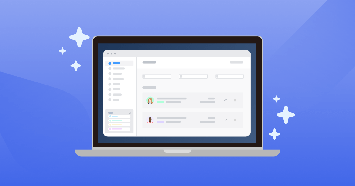
Today, we’re excited to announce the upcoming launch of our new and improved Sine User Interface (UI) which is designed to deliver improved usability and accessibility, while enabling a more intuitive and consistent experience across all Sine products.
First, we’ve updated the look and feel across the entire platform, with a light colour scheme, consistent icons and fonts. This new look creates a consistent experience as users move between different Sine products.
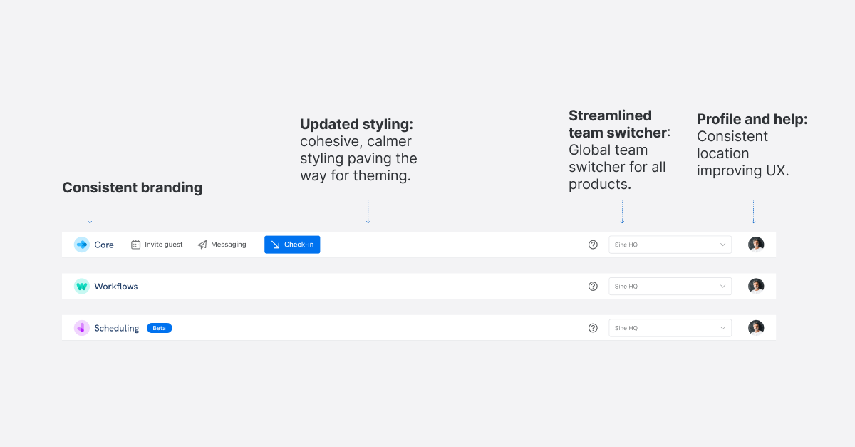
In one of the most important updates, we have standardised the layout and organisation of the UI across all products. These changes deliver measurable improvements to the ease of use for customers and help you work more efficiently when you’re in Sine. While conformance to the Web Content Accessibility Guidelines (WCAG) 2.1, ensures the Sine platform is more accessible to a wider range of people with disabilities, including accommodations for blindness and low vision, deafness and hearing loss, limited movement, speech disabilities, photosensitivity, and combinations of these.
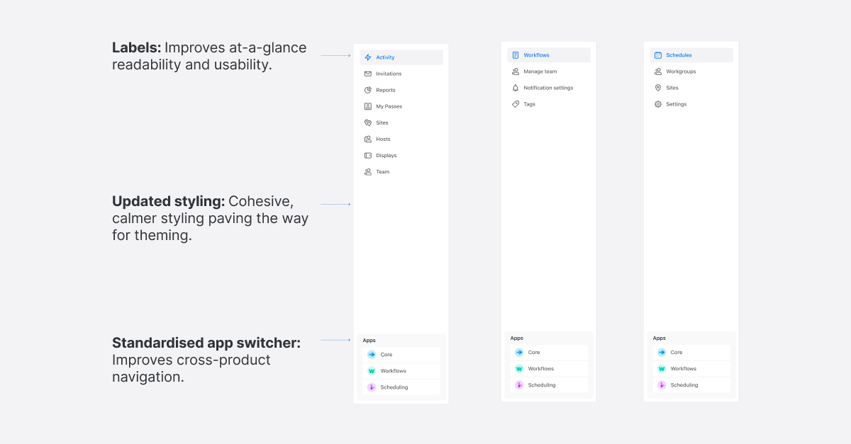
Next, we’ve updated the side navigation bar, introducing a more cohesive, calmer theme across all products. The addition of labels for each menu item makes it easier to quickly scan the menu and navigate where you need to go, while the new, standardised app switcher makes it a breeze to move between products.
All of these updates will be available before the end of November. Existing customers, as well as new customers, will land on the new user interface by default upon logging in after the update is released.
As always, we’re eager to hear what you think. If you have feedback on these improvements, please submit this using the ‘Give Feedback’ button found in the messenger chat bubble found in the bottom right corner of every page of the dashboard.